BLUE BIRD
Blue Bird is an iconic brand based in Georgia. As a Georgia advertising agency, VWA has always admired Blue Bird and this iconic brand in the bus category. Blue Bird asked VWA to participate in a project to name their new groundbreaking EV Bus Chassis and to develop design standards and suggested usage for each name and design. We provided three naming options with logo development, a landing page for each brand, and trade show booth design with promotional ideas at the show. These ideas are aspirational and gave the client a peek at the level of creativity VWA would bring to the Blue Bird EV Chassis.
BRANDING OPTIONS
OPTION 1
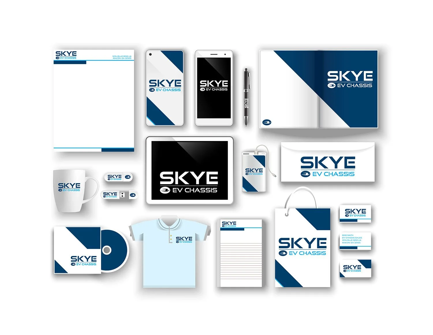
SKYE
When people are looking for answers, they don’t look down they, look up at the sky where the possibilities take them. The sky stands for the infinite possibilities in life. Skye, branded using the Blue Bird “blue”, connects to the heritage of Blue Bird and embodies the numerous positive associations with the word sky. Blue used in branding generates a sense of calmness. Blue stands for trust honesty, loyalty and confidence. Blue is welcomed everywhere because it’s the most popular color in the world. Skye is a more visionary or modern spelling of the word sky. Also it allows for better trademark security and search engine optimization. The Skye brand seamlessly transitions Blue Bird into the EV Chassis market while maintaining the trust that is inherent in the Blue Bird name.
This option uses a modern font creating a more futuristic look and feel for the connection to the future of EV vehicles. The Blue Bird blue connects the two brands together and the lighter blue indicates the color of a blue sky. Adding the E at the end to support the EV Chassis.
LANDING PAGE
This approach creates a clean look and feel to illustrate a more modern approach to the future of EV chassis. It uses the blue from Blue Bird to connect the two brands and the light blue to communicate the color of the sky. The main image can be video or revolving images of the product. The use of icons allows us to section out different information and stats of the product at a glance.
TRADE SHOW BOOTH
OPTION 2
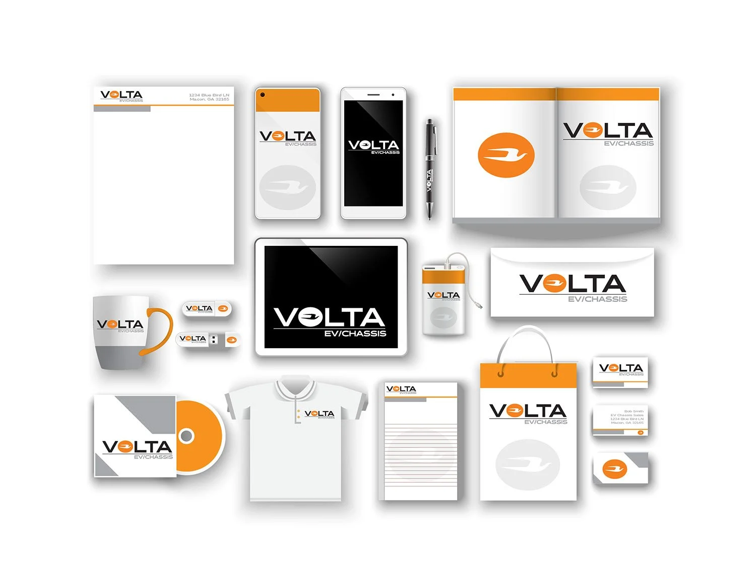
VOLTA
Alessandro Volta was an 18th century Italian physicist whose invention of the electric battery provided the first source of continuous current. Voltaic is a term of, relating to, or producing electricity by chemical action in a battery. By having a name that brings in the discovery of the technology that powers the industry, Volta positions the company as an innovative technology forward manufacturer of customizable EV Chassis.
Where blue and green in Skye and Siali present more emotive position, the Volta brand carries the black and orange color pallet that illustrates a more serious and disciplined approach to the category. Black is considered the most powerful color representing strength and prestige. Too much black can be overwhelming, so we added orange to the “O”. Orange is the perfect complement to black. Orange is optimistic, uplifting and radiates warmth. Together they represent the Volta position of strong, dependable, and optimistic about a bright future in the EV market.
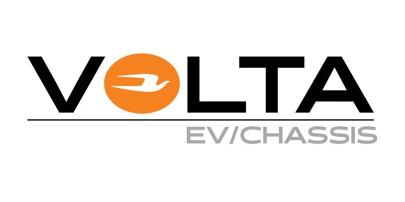
This option uses a bold and extended font associated with the car industry. The use of the colors black and orange creates contracts between the two colors. Inserting the Blue Bird icon into the “O” connects the two brands.
LANDING PAGE
This approach leans more towards the car industry using dark gray and bright orange. The top image can be video or a carousel of images of the product.

TRADE SHOW BOOTH

OPTION 3
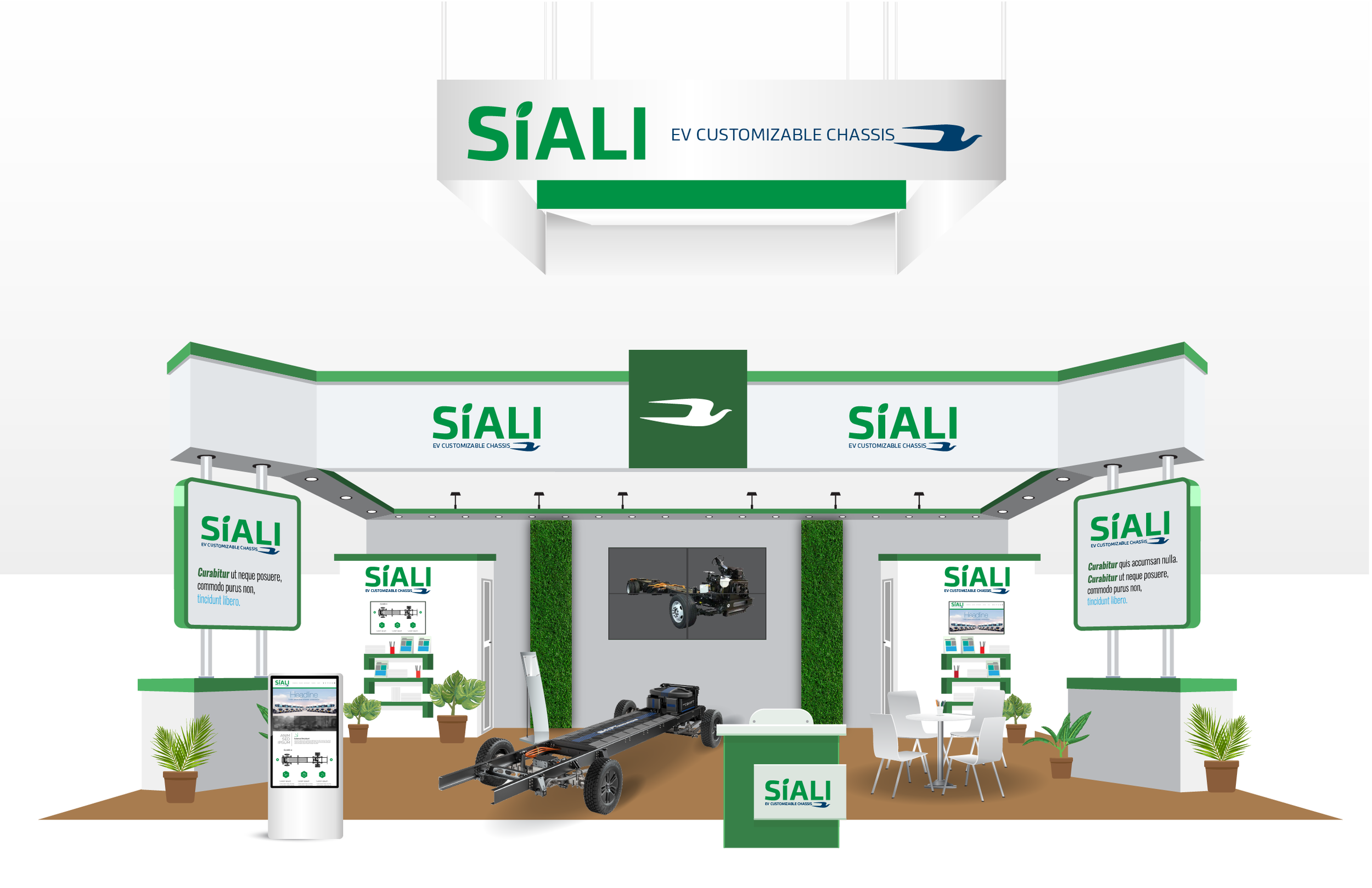
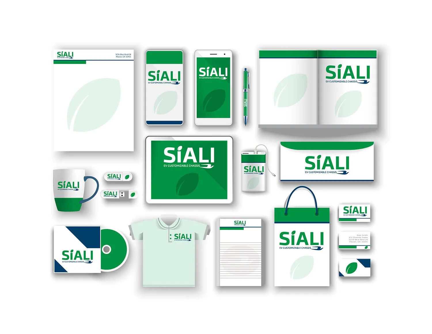
Siali
Often brands take away or change a letter when coming up with a new name. These strategic misspellings increase recall, improve search engine optimization, and can support a stronger trademark. Sialia Sialis is the scientific name of the blue bird. Siali is a strategic misspelling of Sialia Sialis. The EV environmentally conscious category is filled with natural eco-conscious messaging paired with groundbreaking innovation and exploration. Brands need to present themselves as having both characteristics. Siali presents itself as a completely new word that leans towards the future. By ending with the hard “I” the brand is phonetically balanced and easy to remember.
Siali is the most environmentally conscious position of the three brand names we are presenting. We chose the leaf and green to immediately be recognized as a product for the environmentally conscious attributes of the category. In addition, green is proven to be a relaxing color that represents growth and prosperity. It fits perfectly into the EV category.

This option uses the color green to illustrate the connection to nature and a green environment. This option also uses the Blue Bird blue to connect the two brands. Adding a leaf in the “i” for the green connection.
LANDING PAGE
This approach uses a clean white and green look to feel more environmentally safe. Showing multiple photos of the product so the consumer gets a feel of the product at a glance.

TRADE SHOW BOOTH